Fugitive Veggies Delivered
Location Serbia, EU

Sepetka
Food Delivery

Sepetka is a company focused on selling and delivering fresh, locally grown vegetables and fruit to your table. The goal is to spread awareness on healthy foods and support regional farmers while making it convenient and accessible for people with high paced living to have fresh produce in their kitchen.
Sepetka, an old term meaning fruit basket, suggested the brand atmosphere of the 60’s when organic produce was seldom on peoples tables in comparison to mass production we have today. Nostalgia was the theme – the feeling of comfort and taste of grandma’s homemade food. Transforming that feeling into something tangible, friendly and inviting was a lot of fun and it took us all on a trip down memory lane.
We ended up with two different directions and but couldn’t decide which one to go with. We decided to test the solutions through a poll hoping to get answers from future customers.

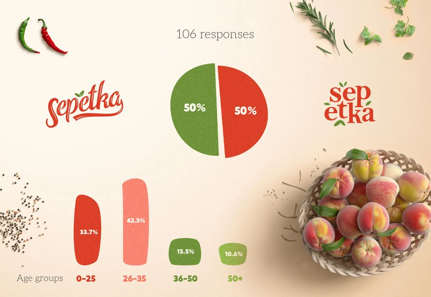
A short survey was sent out to families and friends presenting two options: one, a cursive word mark with a petiole provoking feelings of nostalgia and tastefulness. The other, a modern and playful group of letters symbolizing an imperfect but fruitful homegrown garden.
The survey was consisted of voting for one of these two directions. To get a deeper insight we also asked for the age group (0-25; 26-35; 36-50; 50+) and included two website directions and asked for a comment on why someone liked that solution more than the other. This could have went both ways, but we were curious to see how people would react.
This was the first time we did something like this, we were very excited to see the outcome of our poll.

We received 106 responses and the most surprising result.
It was a draw, 50:50 dead on! We couldn’t quite wrap our heads around it, going through all this trouble and suddenly we were back at square one. It was a great feeling that both options were equally successful, that’s how we saw it.

We had to dig in, look into every response hoping to find a stat that could swing the result in any direction, it was a full-on investigation. The first thing we noticed was 3 types of responses that repeated: one was based just on the matter of preference, another, more concise but containing a little more info, and the third, a paragraph full of pros and cons. We translated them into yay and nay votes, then cross-referenced them with the most relevant target groups (26-35, 36-50), and we got ourselves a winner.
The cursive word mark won the poll, however the other option had better reactions to the website mock-up.

We started working on the branding taking into account the comments from the poll.
Setting the 60’s theme was a great starting point. The brand elements have a vintage feel, colors, photos, logotype, even the delivery truck (the Volkswagen T1). Next up was the site, the main concern being, how can we make something digital, feel natural enough, imperfect, juicy, as nature intended. We were focused on the thought of making the site look like you could just pick whichever fruit or veggie right off the screen.
“Working with B22 was quite an educational experience. While I was trying to jump to solutions, eager to move forward, they were always challenging me to rethink meaning and message. I most appreciated the extent and level to which they take their work, for example, the idea of a survey was very interesting and made me realize how important branding was to customers.”
Dejan Filipovic, Founder & CEO