An Unexpected Journey
Location Serbia, EU

Upside Down
Sports & Recreation
An adventurous story of five guys from Serbia in a bid to turn their homeland upside down by cycling 500km! In the mountains! Their mission stands to smooth out, cultivate, and show an alternate image of Serbia and the potential for Cycling tours. We were hooked right away!
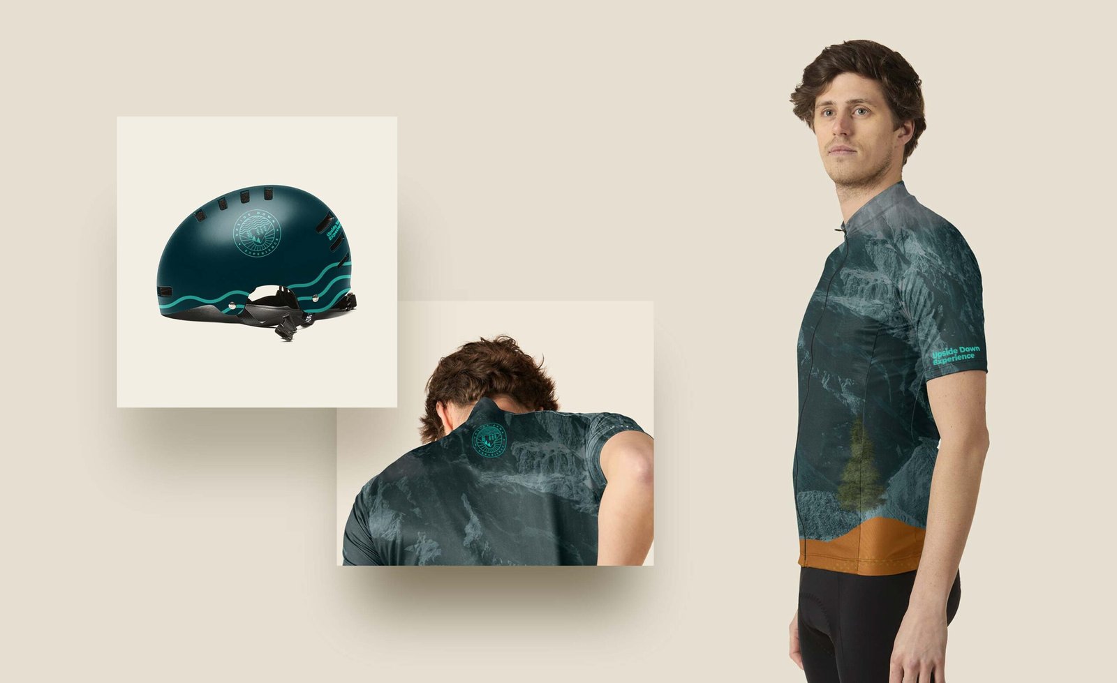
Designing the logo was pretty straightforward since we had an understanding of what it should be from the very beginning. The only requirements were that it had to be simple, and it had to have the elements of an Upside Down Experience. Combining the three most common cycling terrains in a pictogram-style landscape, turned on its head, was the right direction.
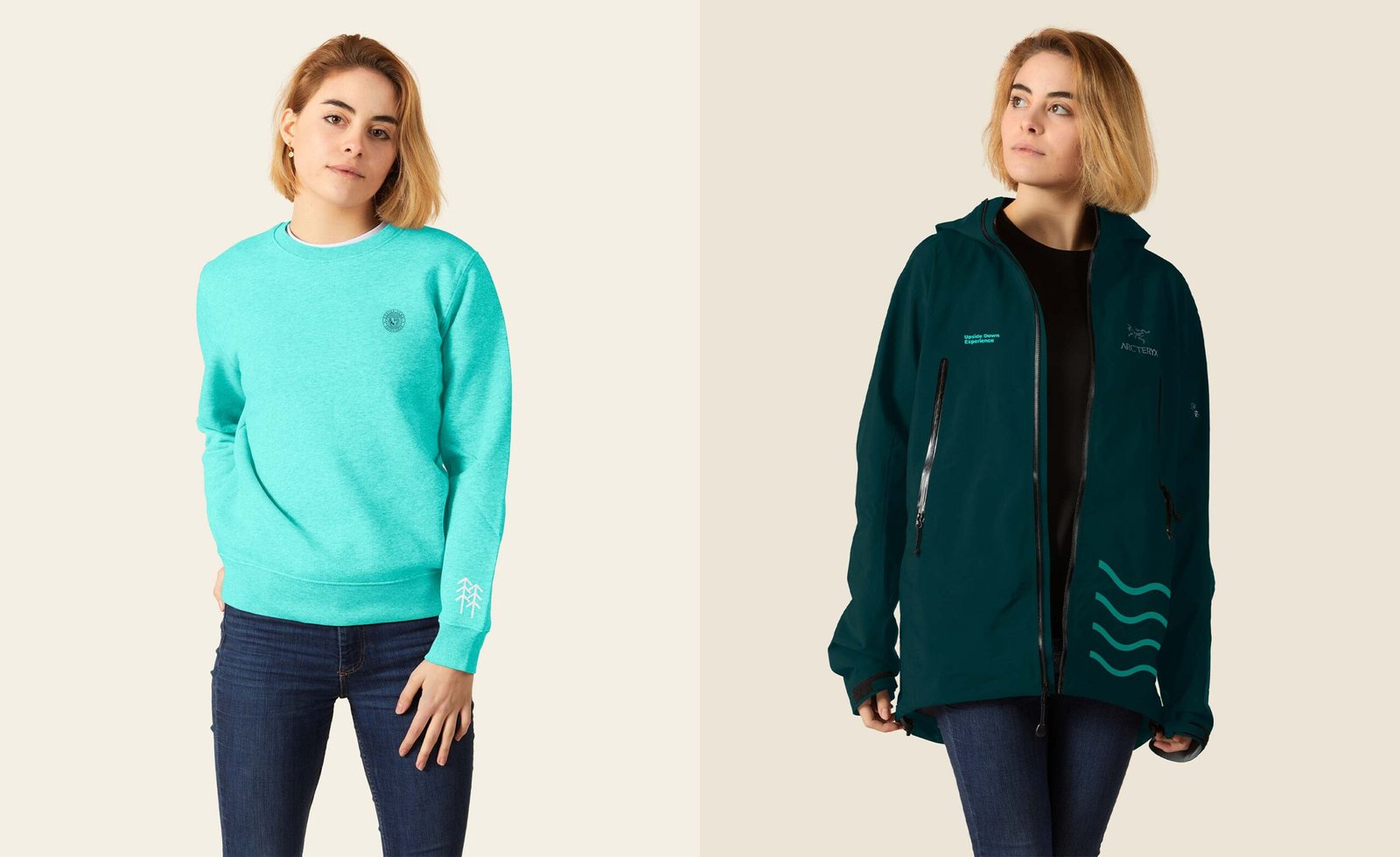
The two main colors were inspired by a gravel bike designed by a Canadian manufacturer of racing and track bicycles, Cervélo. The dark green symbolizes steadiness and the calmness of nature, while the bright teal color stands for the excitement of exploration.
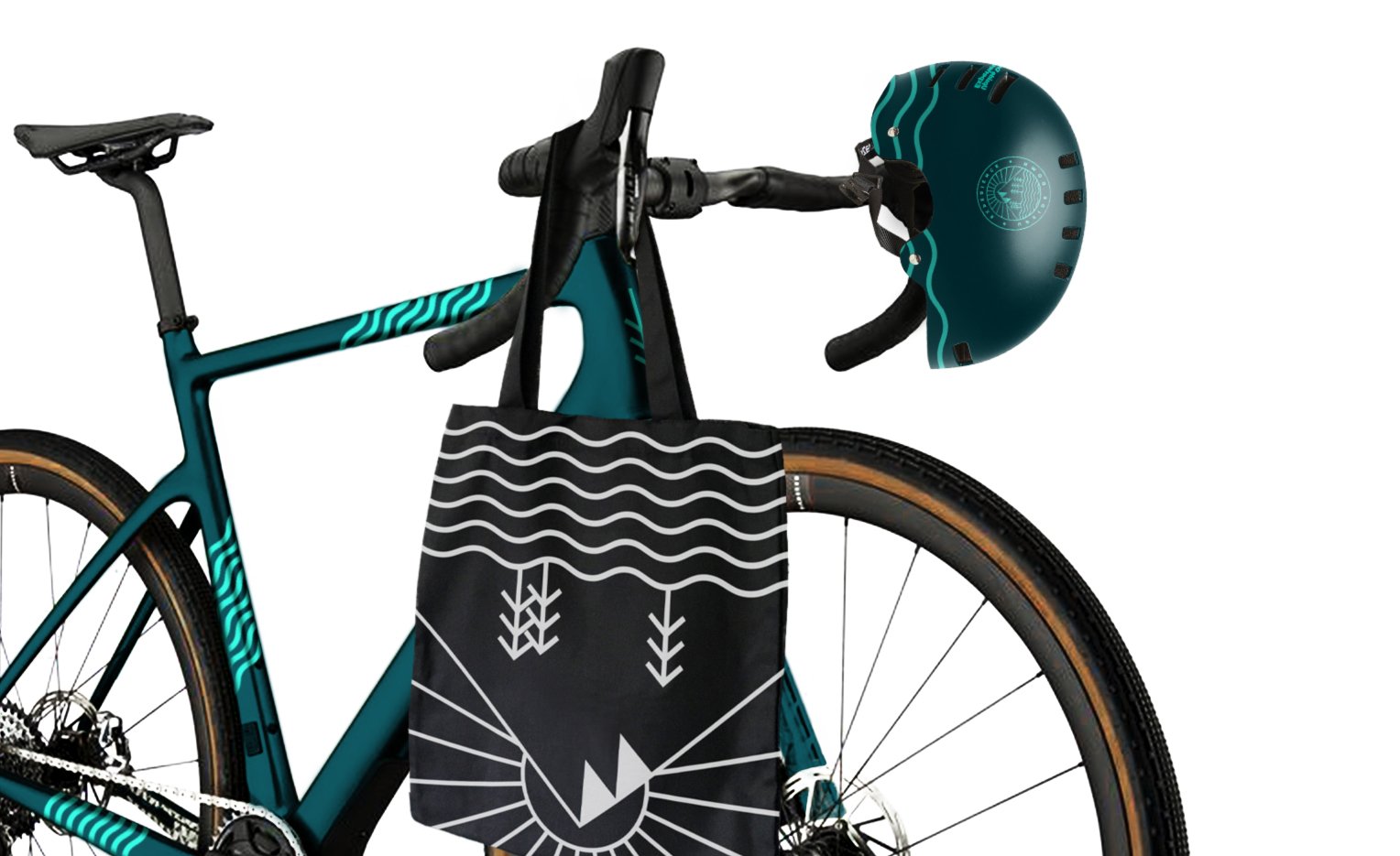
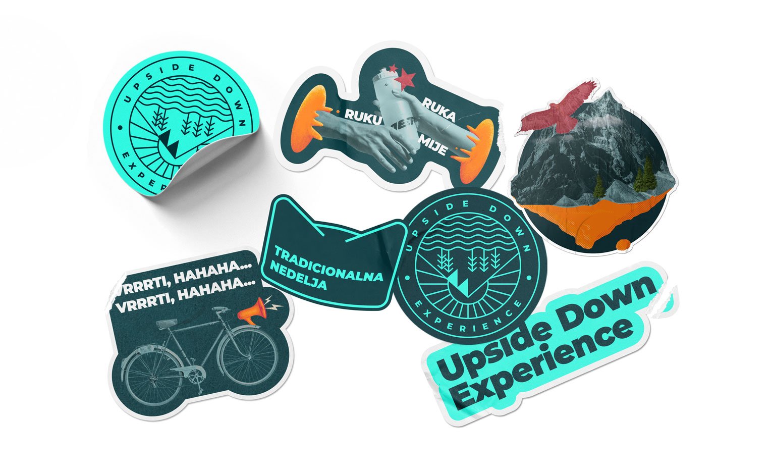
The brand was set and the boys were ready for their adventure.
And they’re off!

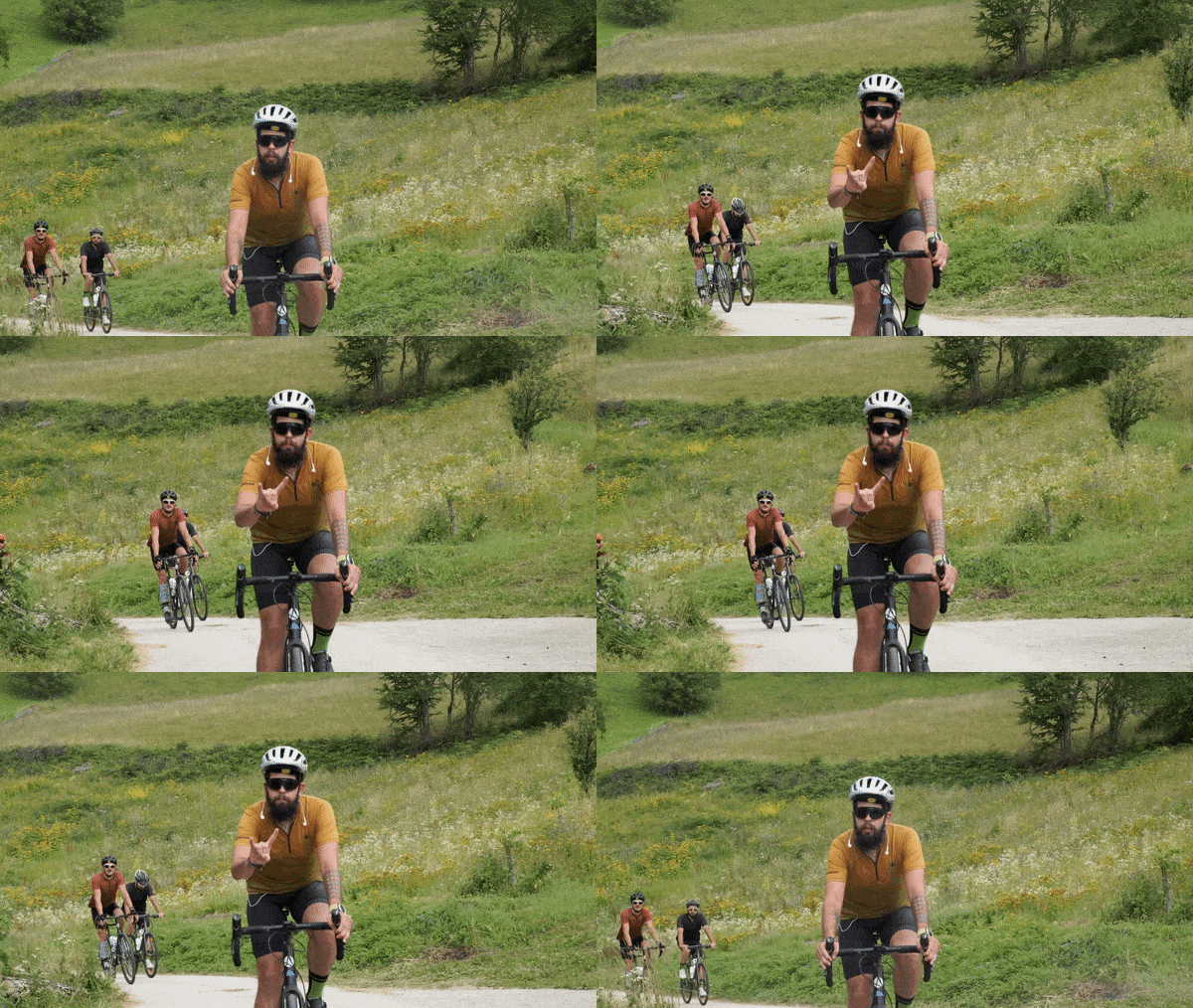
Filming the first-ever Upside Down tour documentary “Two Countries, One Story” was an adventure in itself. The original idea was to film 11 riders (6 in Germany) exploring the Serbian landscape together, but due to covid breakout, the tour had to adapt. With travel restrictions, it was clear that it had to split in two. Two tours, two squads, two film crews, two countries – one story.
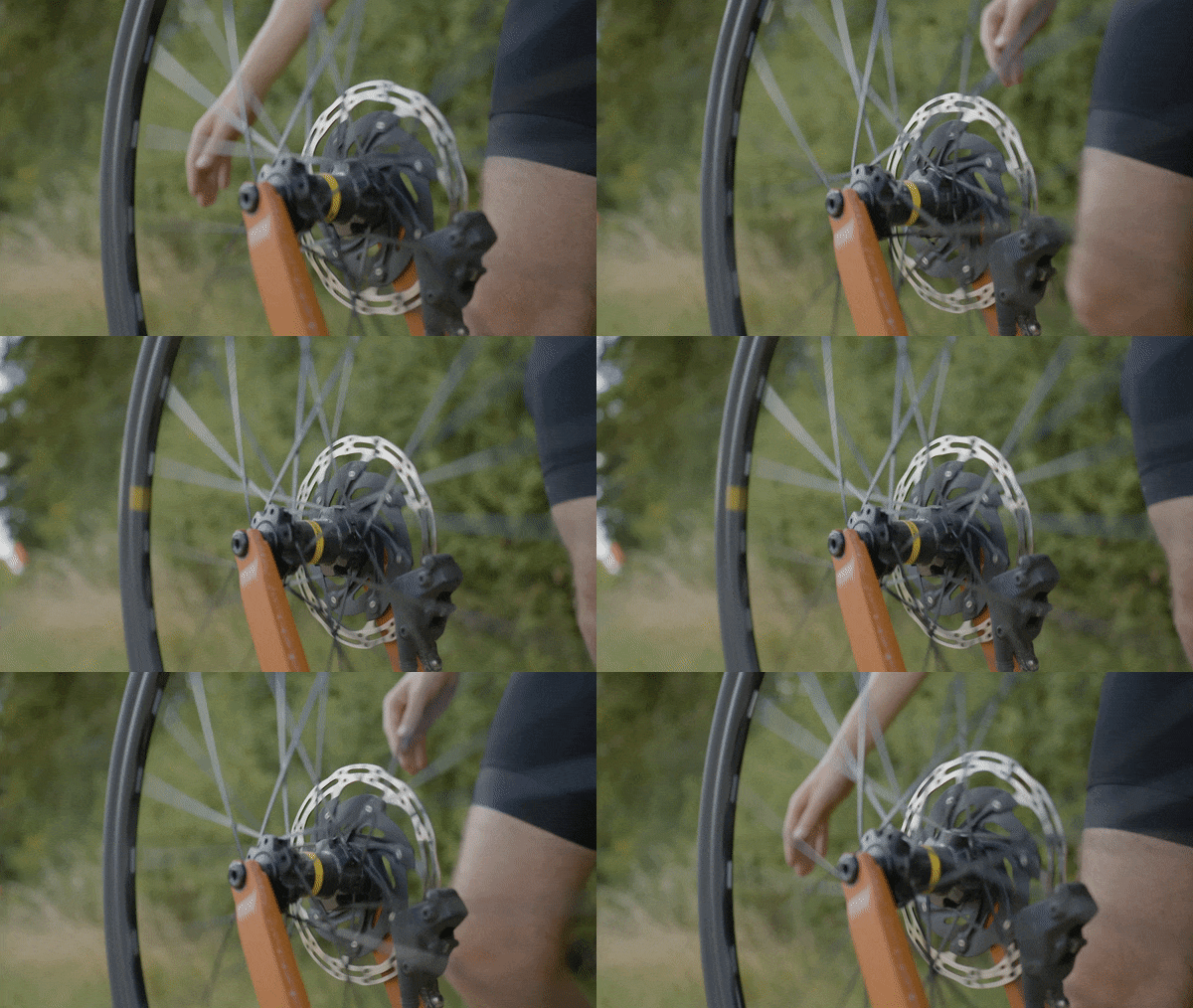
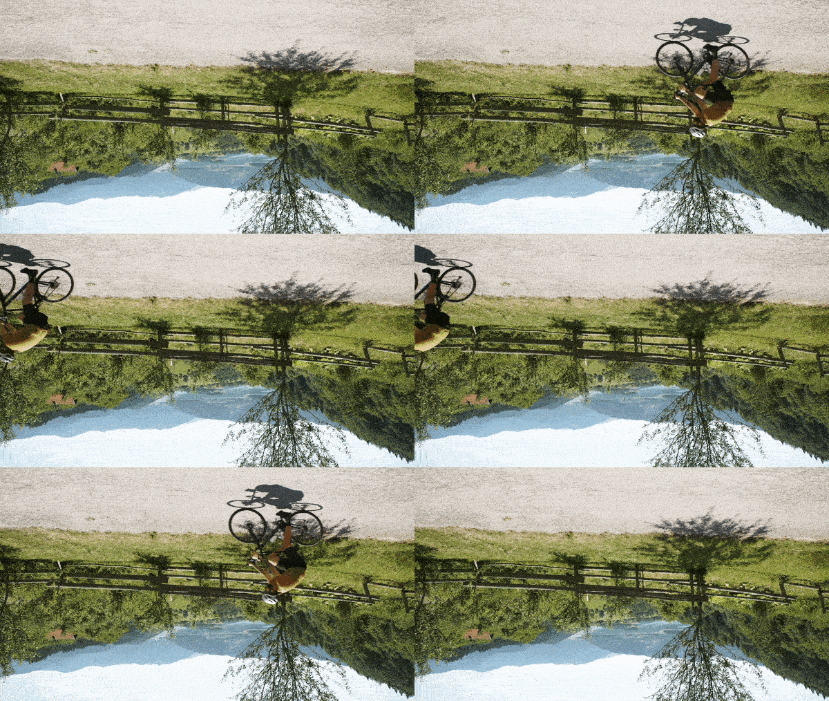

We had 2 camera crews, 2 photographers, and 2 support vehicles. The production was unlike any experience before and had many challenges, but being on tour with the cyclists gave us the energy to cover all possible angles.
The post-production was a challenge as well, mainly due to the fact that we weren’t aware of the material we would end up with. But, bit by bit, the documentary unfolded and its final cut was completed in December 2020.
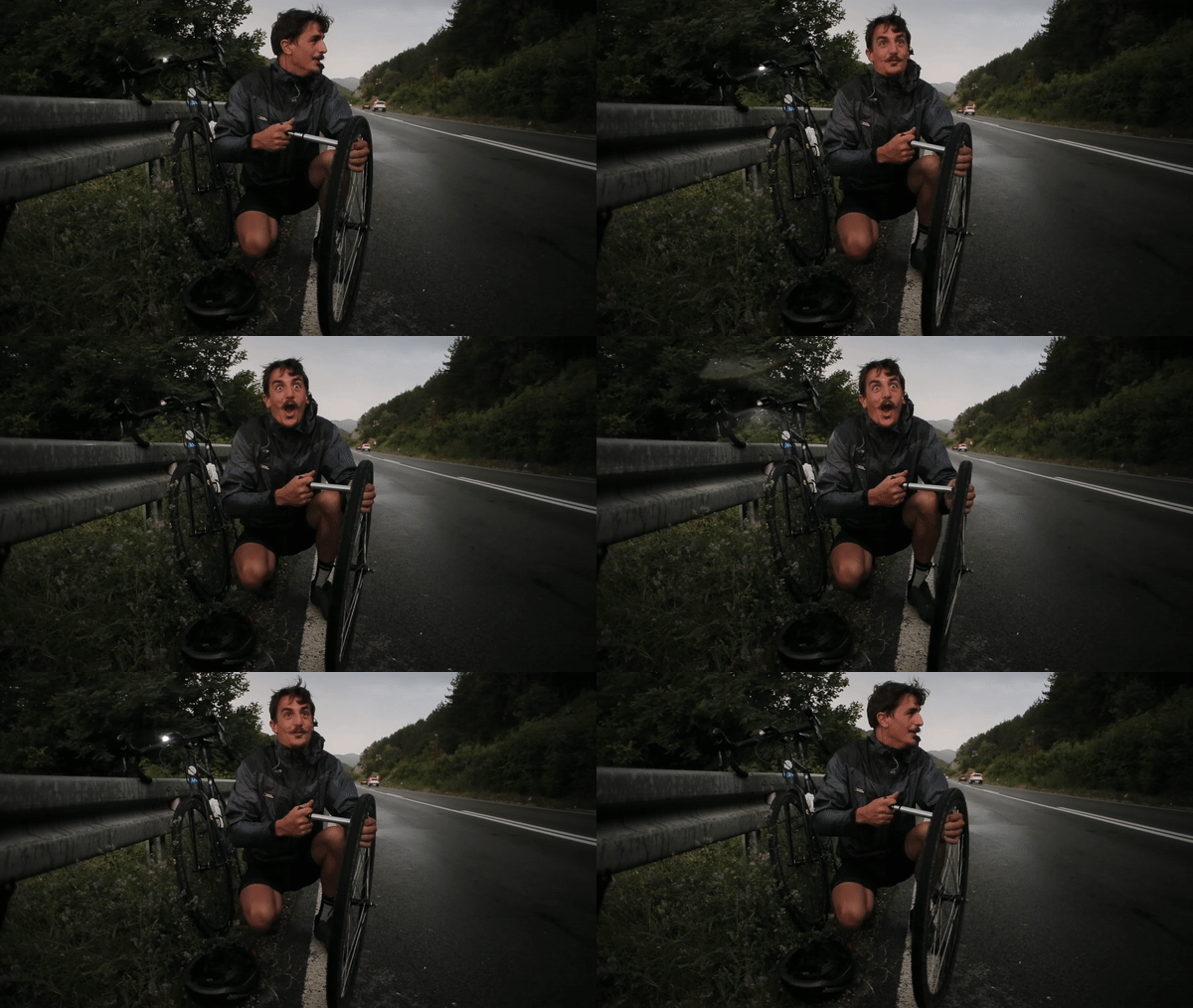
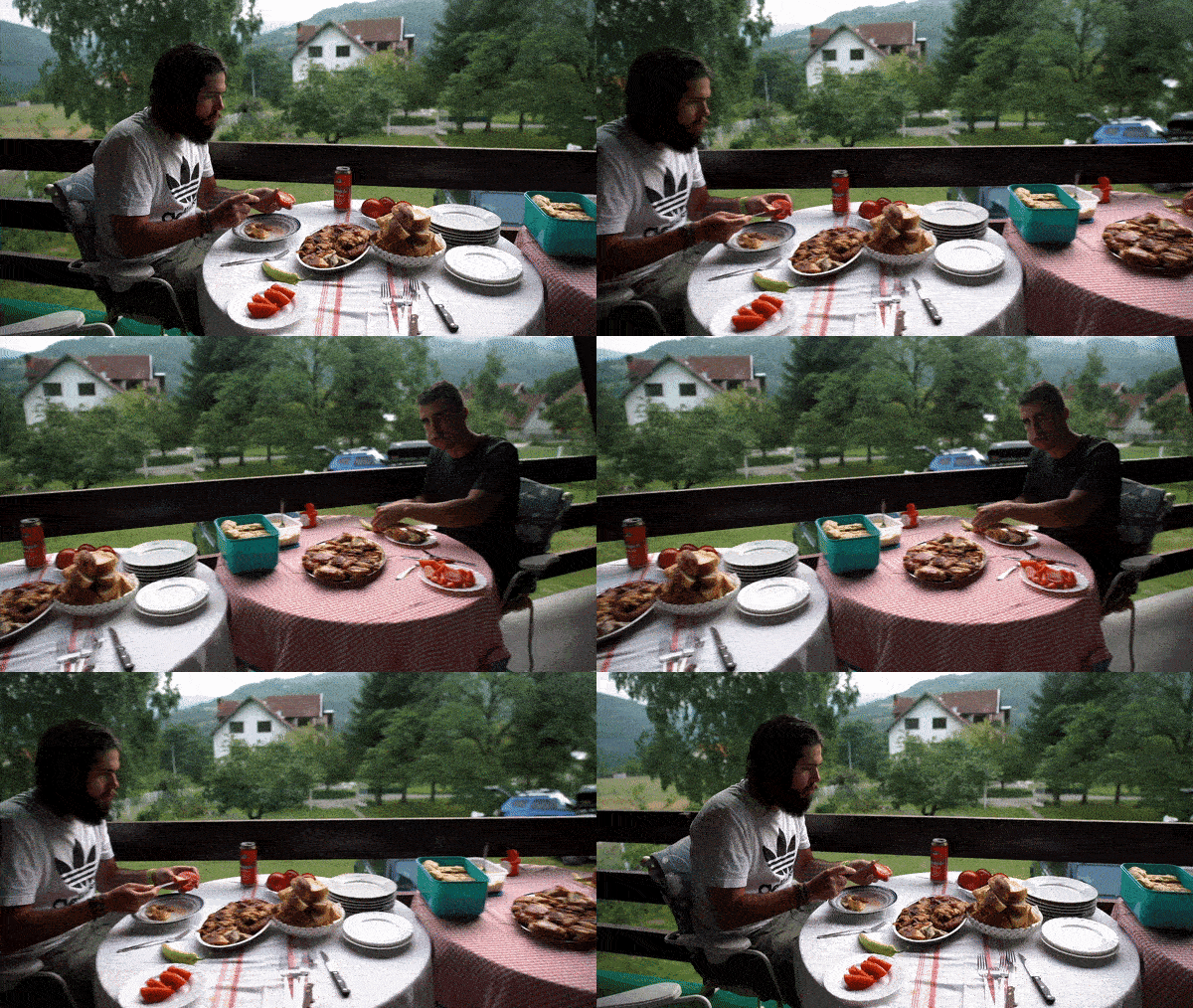
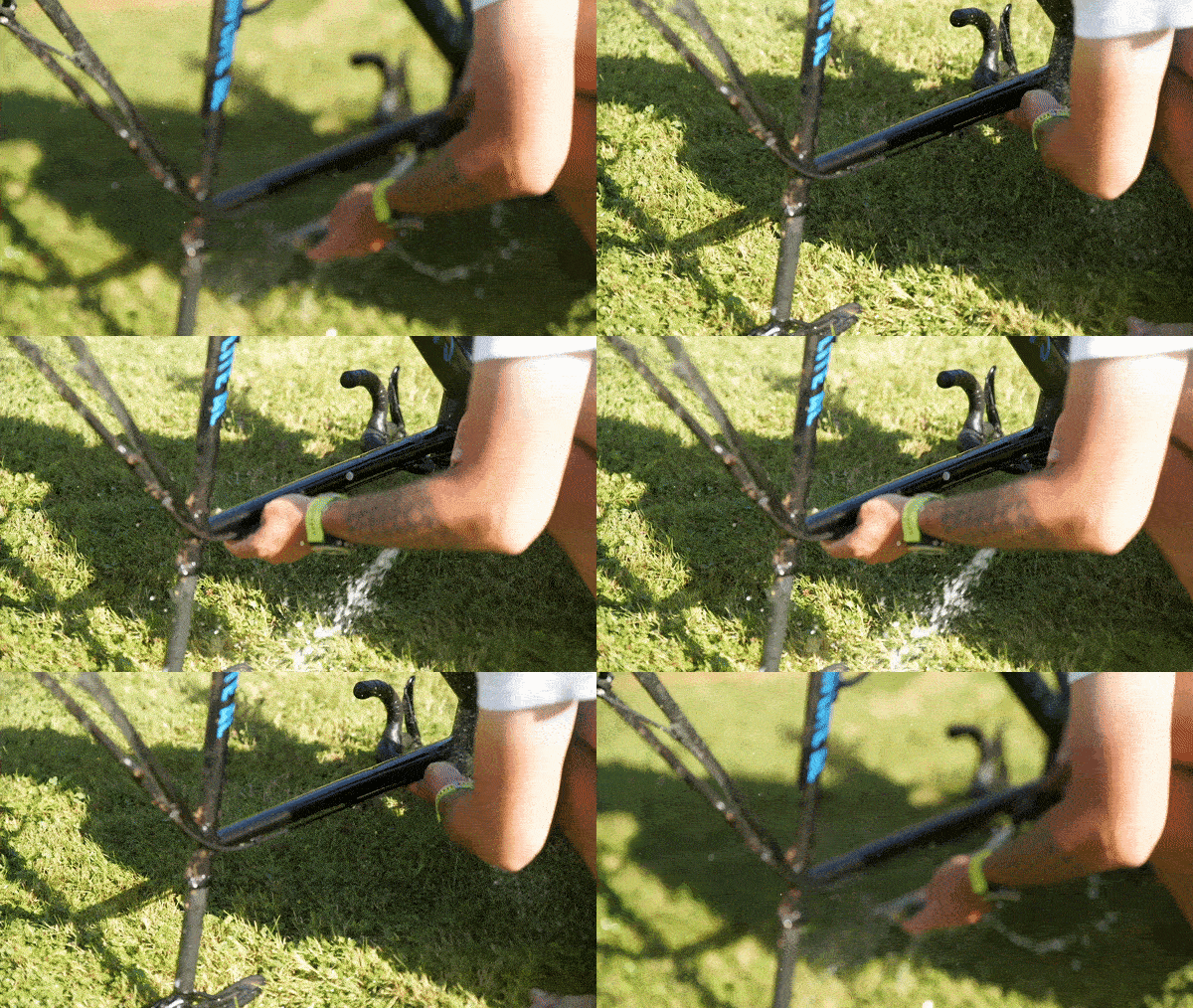
The documentary was out, and everything was buzzing! The boys have managed to deliver an unforgettable experience. Everyone was on a high! A few weeks later, when the dust settled, they came knocking on our door asking for a new website.
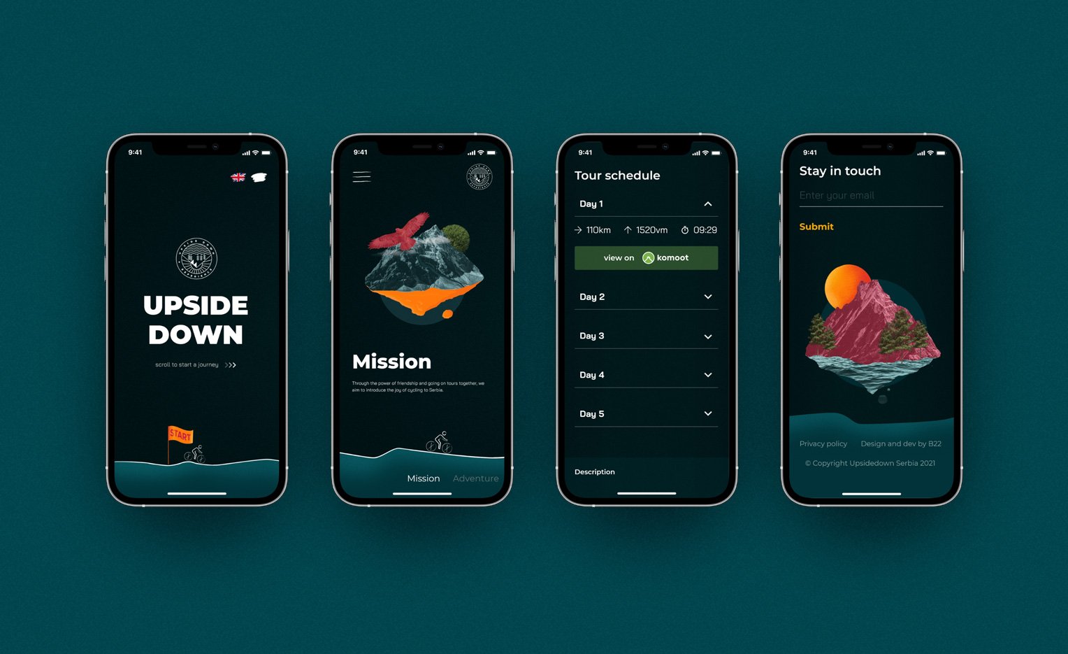
Suddenly, the excitement was back, we just had to honor their enthusiasm by trying out designs we don’t usually have the chance to do. “Let’s try out a home page with a horizontal layout depicting a journey of a small biker.” -we proposed.
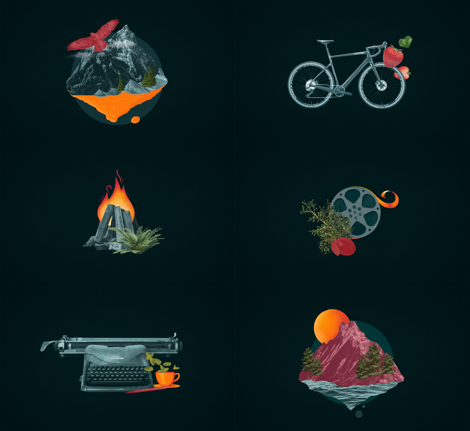
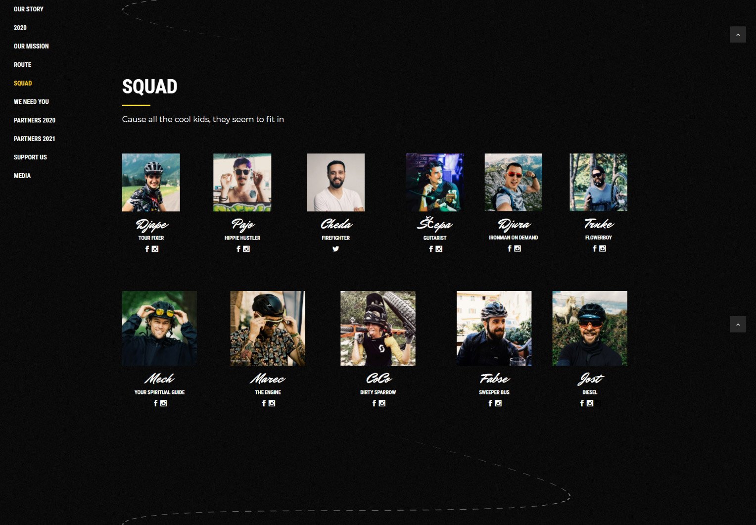
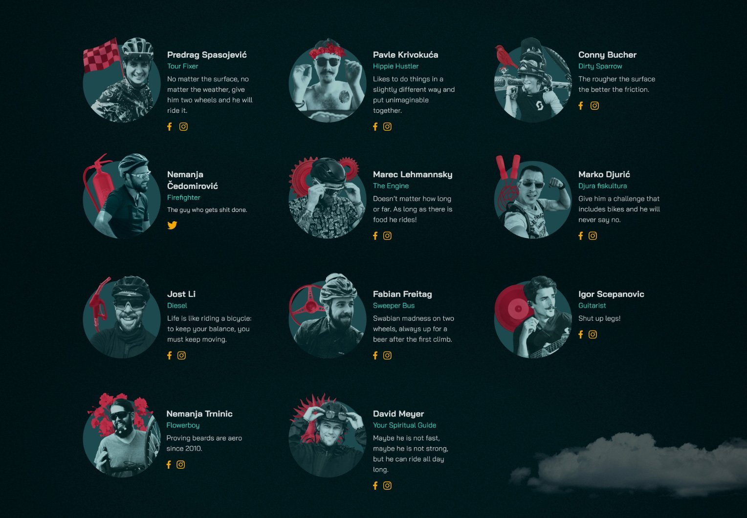
However, the real challenge was the fusion between their previous design with a grungy look and colorful, noisy illustrations to our clear two-colored branding with linear drawings. They wanted to keep that grimy design as it was much more in line with the spontaneity of the Upside Down experience. So, after some research and experimenting, we came up with a suitable technique for the new graphics.
“Wow. I just updated my site and it was SO SIMPLE. I am blown away. You guys truly kick ass. Thanks for being so awesome. High fives!”
Thanks for reading and join the next adventure!
